1509 Leyden

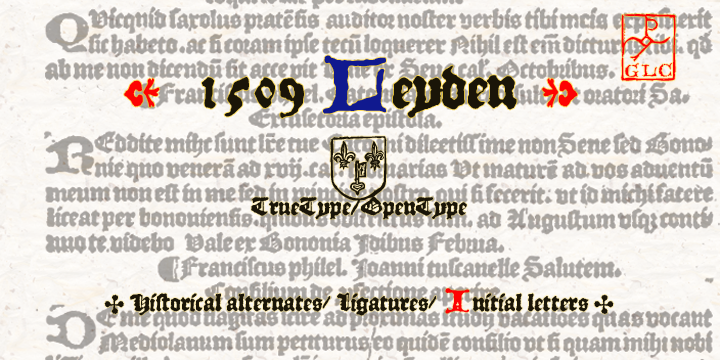
This ancient font as per its name was first used in 1509 in a Dutch town then known as Leyden for printing Francesco Filfelo’s “Breviores elegantioresque epistolae” by Jan Seversz. 1509 Leyden had covered almost one complete set of small lombardic initials, the complete set of lower case characters except w, Eth , etc. , … Read more
Benton Sans

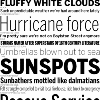
The typeface belongs to the ancient era. During the 1903, the designer of this font had an encounter with welter of sans. He designed News Gothic. This was considered as a 20th Century standard. In the year 1995, Tobias Frere-Jones studied many drawings in the Smithsonian. He then decided to redesign the font.     … Read more

Dranskof

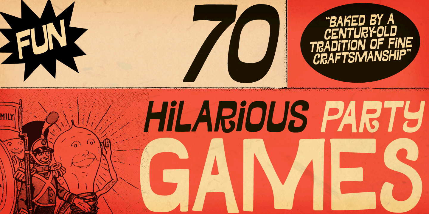
This classy font family from PintassilgoPrints which gives a feel 1960’s and 1970’s was inspired from the famous multitalented in the fields of writing, poetry and journalism; Duško Radović’s Serbian publication of his book for children. Dranskof’s letterform is amusing, eccentric full of light heartedness gives a real feel of joyfulness. Its different glyphs add flexibility … Read more

Solomon

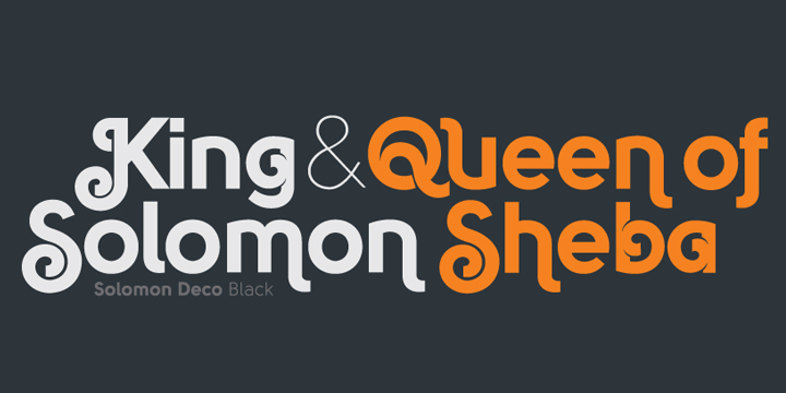
This is an all new Solomon typeface family comprises of about 12 unique design styles. These are further categorized into two primary style groups; namely text family and display (or ornamental) family. The beautiful typeface is ideally fit for headlines of all sizes. The incredibly flexible font is also suitable for text blocks available in … Read more

PF Square Sans Pro

Panos Vassiliou, the renowned designer crafted Square Sans Pro. This was a genuine pursuit of the designer to invent a true square-like text typeface that is efficacious enough to strike a balance within simplicity and vitality. He also strived hard to create a typeface that enhances the calligraphy with its subtle power sans compromising its … Read more

Naïve Inline

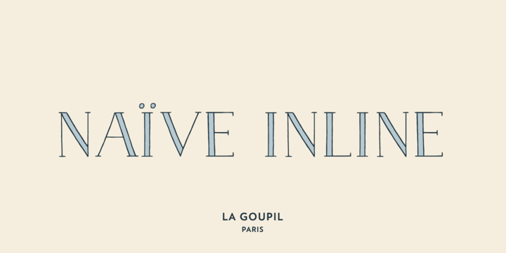
Naïve Inline can be referred to as a serif handwritten font designed by Fanny Coulez for La Goupil Paris. The all new Parisian typography has three weights that can be beautified with a ribbed, bicolor interior, or full to ensure a contemporary and remarkable feeling. Superimposing the 2 elements; the weight above, the interior below … Read more

Jenson Latin

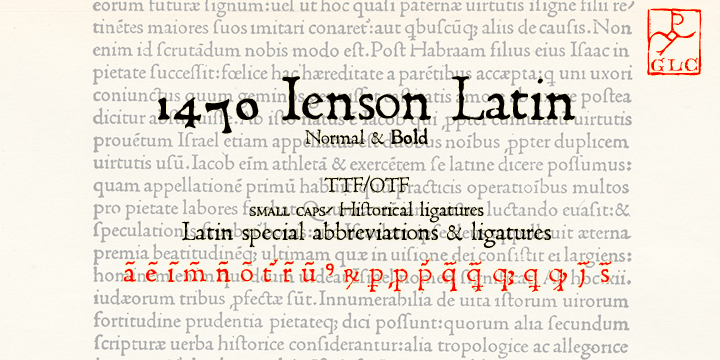
Jenson patterns redefined the fonts after 1470. Even this 1470 Jenson Latin is inspired from it and was first used to print De preparatio evangelica in Italy. The present day font library incorporates all the special abbreviations and ligatures from the original and a few new ones which were initially not available. Having publish by … Read more