Riona sans

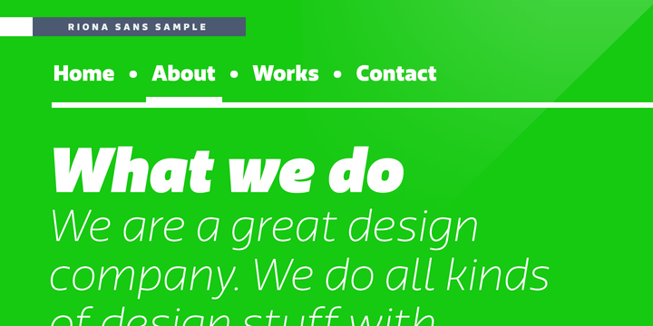
Riona sans is basically a sans serif type family of 16 fonts. This includes true italics. The font can easily handle all kinds of challenge the user throws at it. One can also use it on a variety of platforms such as print, websites, applications, logos, games, logos, and many more. The font looks very … Read more
Sofia pro

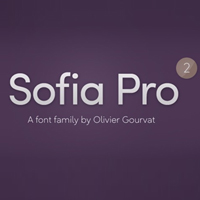
Sofia pro font was originally designed in the year 2008 by Olivier Gourvat. It offers an inkling of innovation, perfect synchronization and roundness. These nuances ensure Sofia pro a harmonious and sagacious appearance for both texts as well as headlines. The font was redesigned in the year 2012.   One of the best things about … Read more

New june

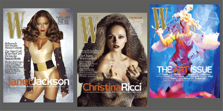
This font has been built with a vision. New June can be referred to as a dynamic unique character. At present, it is being used in a number of magazines around the world.  Some of the best examples include Harvey Nichols magazine in London and later W magazine in New York. The amazing typeface is … Read more

Benton Sans

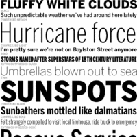
The typeface belongs to the ancient era. During the 1903, the designer of this font had an encounter with welter of sans. He designed News Gothic. This was considered as a 20th Century standard. In the year 1995, Tobias Frere-Jones studied many drawings in the Smithsonian. He then decided to redesign the font.     … Read more

Solomon

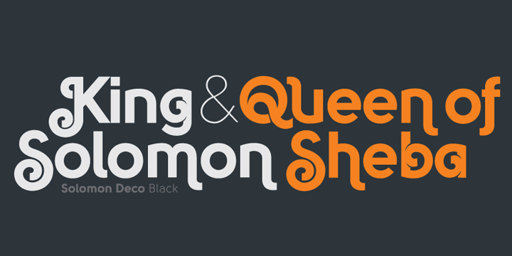
This is an all new Solomon typeface family comprises of about 12 unique design styles. These are further categorized into two primary style groups; namely text family and display (or ornamental) family. The beautiful typeface is ideally fit for headlines of all sizes. The incredibly flexible font is also suitable for text blocks available in … Read more

PF Square Sans Pro

Panos Vassiliou, the renowned designer crafted Square Sans Pro. This was a genuine pursuit of the designer to invent a true square-like text typeface that is efficacious enough to strike a balance within simplicity and vitality. He also strived hard to create a typeface that enhances the calligraphy with its subtle power sans compromising its … Read more

Naïve Inline

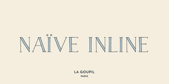
Naïve Inline can be referred to as a serif handwritten font designed by Fanny Coulez for La Goupil Paris. The all new Parisian typography has three weights that can be beautified with a ribbed, bicolor interior, or full to ensure a contemporary and remarkable feeling. Superimposing the 2 elements; the weight above, the interior below … Read more