Avenir Next Pro

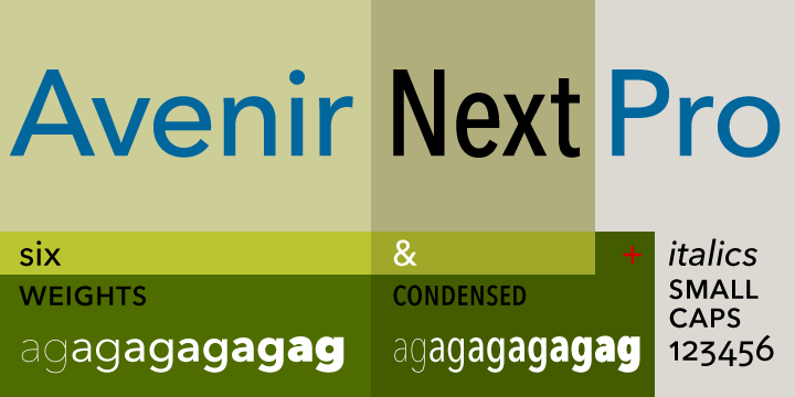
Avenir Next Pro is beautiful font was designed in the year 2004, by Frutiger with Linotype in-house type designer Akira Kobayashi. The primary motive of the design was to restructure the Avenir family and make it proficient in handling on-screen display issues. This new font was titled Avenir Next. The typeface family was then increased … Read more
Steagal

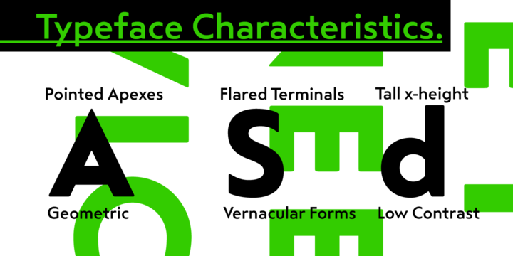
Steagal The typeface was created by a geometric sans serifs lover. The designer fell in love with crispness and rationality of sand serif. The desire to create a font evoking the spirit of printed Futura of the 1940s combined with the hard to pin down quality developed steagal. The designers of this font initially studied Chattanooga’s … Read more

Pluto Sans

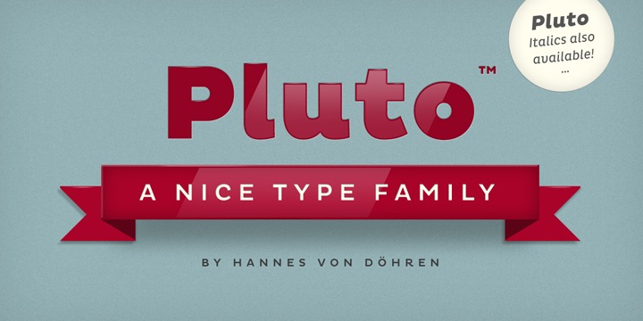
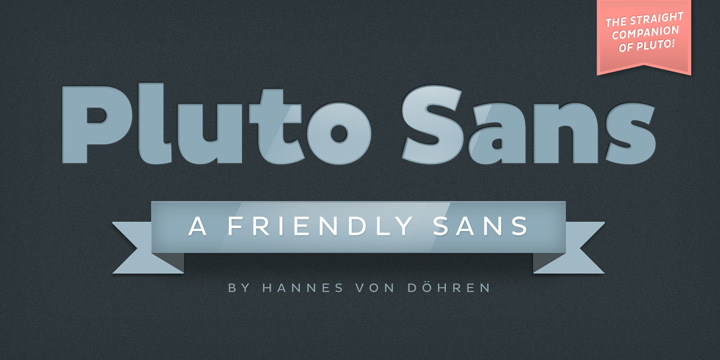
Pluto Sans is the direct escort of the famous Pluto Family. Designed Hannes von Döhren in the year 2012, this crystal clear Sans Serif family typeface is based on the highly appreciated Pluto architecture with a tip-off of the affable feeling the idiosyncratic Pluto conveys. Its unique geometric forms and large x-height makes the typeface … Read more

Pluto

Pluto, the unique font designed by Hannes von Döhren in the year 2012 is a full-fledged family of 64 fonts including 16 Pluto Italics, 16 Pluto Uprights, 16 Pluto Sans Uprights and 16 Pluto Sans Italics. The designer created this amazing typeface keeping in mind informal and friendly nature that attracts user from different fields. … Read more

Octant

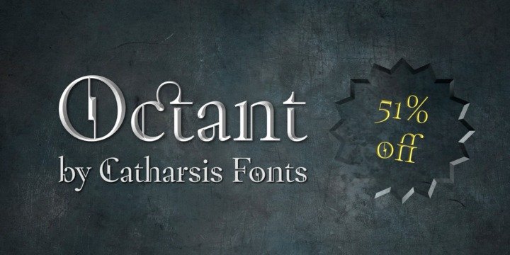
Octant was designed by Christian Thalmann. Octant font is a typeface font.  Its overall shape is based on the familiar timeless proportions of humanist serif tradition, which renders it easily legible. Thanks to its unique and unmistakable look, it delivers a memorable impact in any role.  Octant comes with extensive language support and a generous collection of ligatures. For … Read more

Ollie

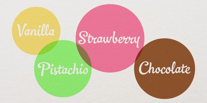
Ollie is designed by Dave Rowland. Ollie font is  a casual signage script whose friendly. Ollie includes about 900 glyphs, many of which are automagical substitutions to keep the text flowing smoothly, and to pseudo-randomly pick different glyphs to avoid repetition. Ligatures should be on by default, for a much nicer looking tt combination, and a few others besides. The … Read more

Burgues script

Burgues script is developed by Alejandro Paul. Burgues script font is inspired after Louis Madarasz  whose legendary pen has inspired schools of penmanship.  Burgues received important awards such as a Certificate of Excellence TDC2 2008 and a Certificate of Excellence at the Bienal Tipos Latinos 2008. The two main sources for Burgues were the calligraphy examples shown in Zaner Bloser’s … Read more