Canapé

Canape font

Canapé is anchored in the idea of letters with a faintly curved and vaguely amended line. This helps the typeface get a warm and friendly feeling and a kind of haptical appearance. This brings certain type of cosiness to any communication through lettering. Canapé has been crafted with great attention to detail. The type family … Read more

Calibri

Download Calibri font

Calibri is definitely a modern sans serif family typeface that embraces subtle roundings on stems and corners. The font features real italics, small caps, and a number of numeral sets. The proportion of Calibri facilitates high impact in snugly set lines of full-size and small text in a similar way. Calibri’s countless curves and the … Read more

ITC Blair

ITC Blair font

ITC Blair font family was originally crafted by Jim Spiece in the year 1997. It is a contemporary, flexible version of the Blair font initially designed and released in the year 2000 by the Inland Type Foundry. The upper case letters of sans-serif are wide. It works towards offering the font a panoramic feel. Download ITC … Read more

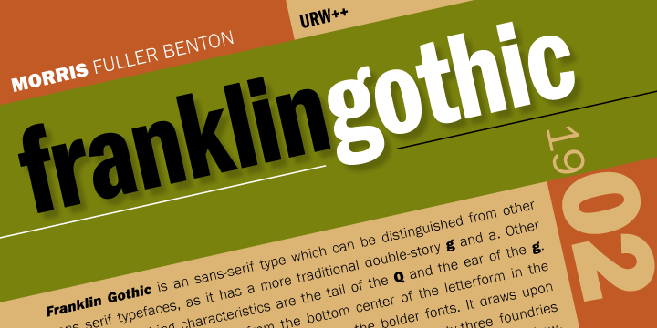
Franklin gothic

Franklin Gothic

Franklin Gothic and its related faces are realist sans-serif typefaces originated by Morris Fuller Benton (1872–1948) in 1902. “Gothic” is an increasingly archaic[citation needed] term meaning sans-serif. Franklin Gothic has been used in many advertisements and headlines in newspapers. The typeface continues to maintain a high profile, appearing in a variety of media from books … Read more

PF Champion Script Pro

PF Champion Script Pro

PF Champion Script Pro can be referred to as the most advanced and dynamic calligraphic family ever designed. The Modern Cyrillic 2009, a Type Design from the International Type Design Competition held in Moscow honoured this typeface for Excellence. It also received another laurel from Granshan Awards 2010, the 3rd International Eastern Type Design Competition. … Read more

Adelle basic

Download adelle basic font

Adelle basic can be defined as a slab serif typeface. It was devised specifically for intensive editorial use. The primary usage was meant to be in newspapers and magazines. The overall personality and flexibility of the typeface makes it a real multiple-purpose font. The transitional weights contribute to a highly legible and neutral look when utilized … Read more