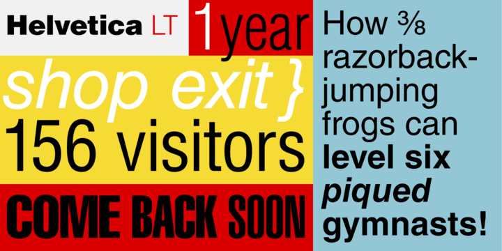
Helvetica

Helvetica is known to be the most remowned type of all popular typefaces. It was actually designed by the famous typeface artist Max Miedinger in the year 1957 for the Haas foundry of Switzerland. The design is purely based on the fantastic happenings of the late nineteenth century. However, the new refinements have categorized the font … Read more
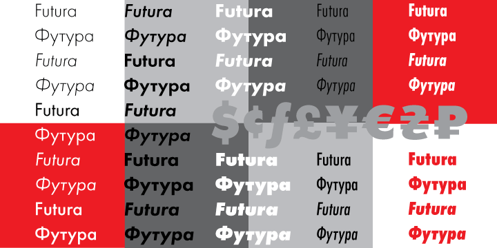
Futura PT

Futura PT is designed for Bauer company in the year 1927, this amazing sans serif typeface is purely based on geometrical shapes. The font can also be referred to as the representative of the Bauhaus school aesthetics of the 1920s-30s era. The font is also issued by the Bauer Foundry. It has been arranged in a … Read more

Geogrotesque

Geogrotesque can be defined as a semi modular font with a subtle rounded finish typeface. The unique typeface has characters based in formal principle with its equivalent optical adjustments. This is done to ensure easy and perfect adaptation of the system to an alphabet for perfect texts. The typeface family is known to possess a … Read more

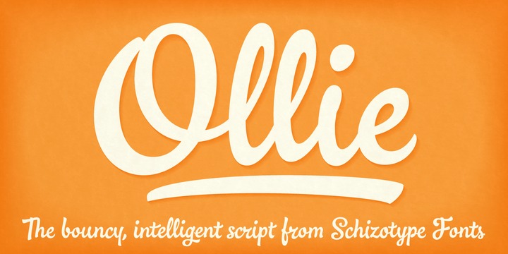
Ollie

Ollie, the casual signage script is available with super friendly, bouncy exterior. The typeface ensures sophisticated OpenType programming. The font has been designed in a way to make the most out of popular OpenType savvy applications. The typeface is highly recommended and renowned for its professional design use. It is available with its unique calt … Read more

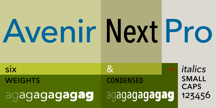
Avenir Next Pro

Avenir Next Pro is beautiful font was designed in the year 2004, by Frutiger with Linotype in-house type designer Akira Kobayashi. The primary motive of the design was to restructure the Avenir family and make it proficient in handling on-screen display issues. This new font was titled Avenir Next. The typeface family was then increased … Read more

Steagal

Steagal The typeface was created by a geometric sans serifs lover. The designer fell in love with crispness and rationality of sand serif. The desire to create a font evoking the spirit of printed Futura of the 1940s combined with the hard to pin down quality developed steagal. The designers of this font initially studied Chattanooga’s … Read more

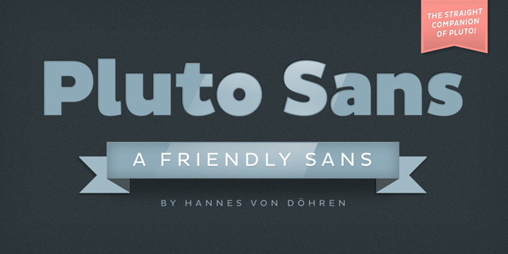
Pluto Sans

Pluto Sans is the direct escort of the famous Pluto Family. Designed Hannes von Döhren in the year 2012, this crystal clear Sans Serif family typeface is based on the highly appreciated Pluto architecture with a tip-off of the affable feeling the idiosyncratic Pluto conveys. Its unique geometric forms and large x-height makes the typeface … Read more