by fontocean | May 23, 2013
The typeface was designed by Eric Gill for the Monotype Corporation. It is an eye catching font that religiously follows principles established by Edward Johnston. The typeface was also the first sanserif of its kind to be...
by fontocean | May 22, 2013
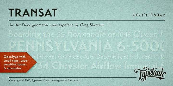
Transat, the strikingly beautiful geometric sans serif typeface was introduced way back in 1930s. The caps of the font are inspired by Art Deco signage that was discovered in the “Gare Maritime” ocean liner terminals. The forename of the typeface “Transat” is an...
by fontocean | May 22, 2013
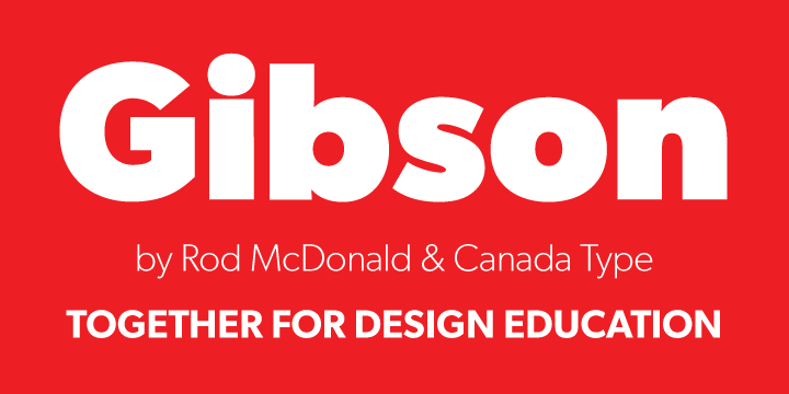
The incredible typeface is humanist sans serif font fashioned by renowned Canadian type designer Rod McDonald FGDC. The font is a way to paying tribute to dynamic life of John Gibson and his ardent love for typographic arts. Most Canadian design schools and...
by fontocean | May 22, 2013
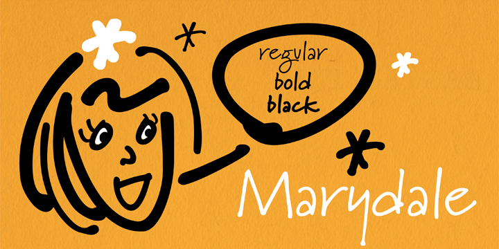
Marydale, a highly skilled and creative art director designed this amazing typeface while helping produce a trade magazine many years ago. The incredible hand-lettering made this font a desirable element for many purposes. The penmanship of the designer was widely...
by fontocean | May 21, 2013
Reina has been inspired from the sweet letters of calligraphy and typography masters of the ancient times including Bodoni, Didot, and the amazingly talented Herb Lubalin. The basic aim of typeface initially was to integrate the decorative honours from blackletter and...

by fontocean | May 20, 2013
DIN Text Pro is official proposal for DIN 1451 was made in the year 1936 by the German Standards committee Deutsches Institut Normung (DIN). This was the paradigm lettering type to be used in the road traffic arena. The principle of this standard was to set down an...
