St Marie

st marie font

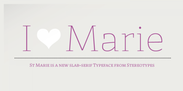
St Marie is a highly creative opentype face St. Marie. It works for ensuring a very nice, graceful thin slab serif face combined with a bit of chunky curve appeal.   The typeface is perfect for text and outsized headlines where users would like to integrate a versatile and first-rate lettering for their project. Get … Read more

Sevigny

sevigny font

Sevigny is for poetry . Ever fascinated by stitching techniques your grand mom followed to come up with something great for your holidays? This unique font is definitely for the poetic eye. It sways, dances, and sings to readers just as a piece of thread would do on the needle. The appearance of this typeface is distinct … Read more

Sirba

sirba font

Sirba is a simple, serif typeface family with clean lines and an amicable personality. It was originally developed to cater to the demands in intricate text environments such as annual reports, dictionaries, academic texts, novels, magazines etc. It comes in a huge number of designs with open counters, the large height and petite ascenders and … Read more

That

Download That font

That is a beautiful family font of four weights. It comes in roman and true italics styles that come armed with chiselled medium weight. You would also love its irregular variants that can be used for a variety of purposes including letter heading, signboards, magazines and much more. Get That font on MyFonts That font details … Read more

Pona

pona font

Pona, the simple typeface belongs to the classic serif family. The font is an elucidation of some of the most renowned serif fonts such as Goudy, Times, Georgia, and Garamond. Pona offers elusive letterforms in conjunction with a large x-height. It also circumscribes moderate contrast that is highly valuable in use with small sizes and … Read more

Semplicita Pro

Download Semplicita Pro font

Semplicita Pro is an all-new sans serif design that fluently overlaps the tri-cornered carves up between the geometrical, humanist, and gothic sans serifs. The designers started by reassessing Semplicità, Alessandro Butti’s 1930 design ifor Nebiolo. The font is fuelled by Futura, Semplicità and ensures designers the precise clue to the future. It works towards replace … Read more