Corinth
Corinth is certainly one font that should be part of any designer’s arsenal. Why? Apart from being perfectly legible, it is also perfect for when you want to add a bit of retro and hand-made feel to your message or logo. It pairs nicely with script letterforms,...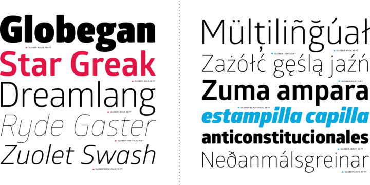
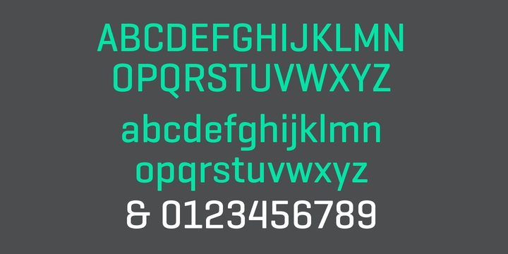
Glober
Glober is most certainly a font that’s versatile and legible in all of its variations and there are 18 weights for this font – equal number of upright letterforms and italics. What’s nice about it is that it supports both Latin and Cyrillic alphabets. Characteristic...
congenial
Congenial font is a sans-serif typeface built as understated, highly legible complement to Laura Worthington. Congenial retains some hand-drawn elements, visible particularly in the heavier weights . At lighter weights the strokes become almost monoline. Download...