by fontocean | Feb 13, 2013
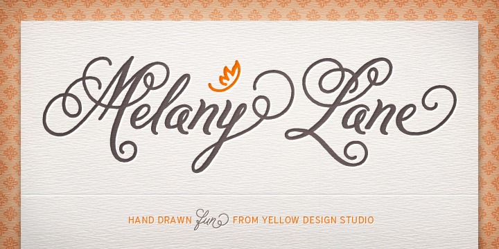
Melany Lane originated at the Yellow Design Studio. It is a typeface flourish script based on conventional letter forms However, the added quirks and its original warmth make it unique. Created by Ryan Martinson, the font enjoys letters that are connected...
by fontocean | Feb 13, 2013
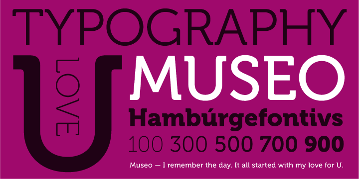
Museo is a result of creator Jos Buivenga love for the letter ‘U’ in uppercase. The image inspired Jos and he modified it via bending top portions of the stems into semi-slab serifs. This theory helped Jos to work out the rest of the uppercase letters. He first wanted...
by fontocean | Feb 13, 2013
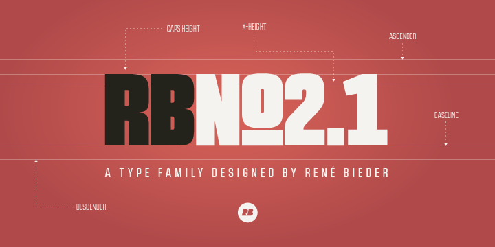
Created by Rene Bieder, the RBNo2.1 is a condensed sans serif typeface that comes equipped with an impressive technical and geometric look. The typeface family comprises of 2 different versions: RBNo2.1a RBNo2.1b The font has 7 weights and matching italics. It is...
by fontocean | Feb 13, 2013
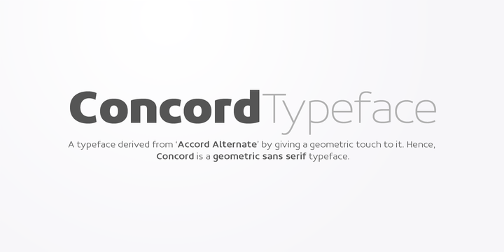
Concord is a typeface enjoys simplicity as its core element. Created by Aakash Soneri, this font is derived from ‘Accord Alternate’, a popular typeface family. The designers gave this family, a new, unique geometric touch to it. This is also the reason Concord is...
by fontocean | Feb 12, 2013
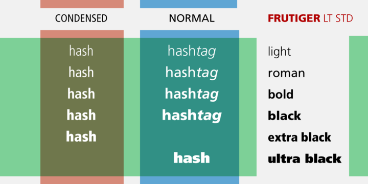
Frutiger was created by Adrian Frutigerin the year 1968, this amazing font was originally custom-built to extend a signage system ideally suited to the structural design of the new Charles de Gaulle Airport situated outside Paris. The font is simple, clean, and...
by fontocean | Feb 12, 2013
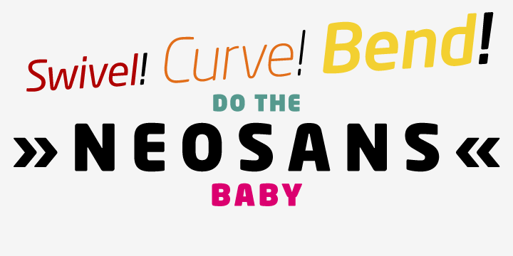
Neo Sans started out as a fascinating project from a branding organization. The client was looking for an “ultra modern” typeface family. The idea was to get a “futuristic font sans the attention-grabbing or transient feel.” Created by Sebastian Lester, the font is...
