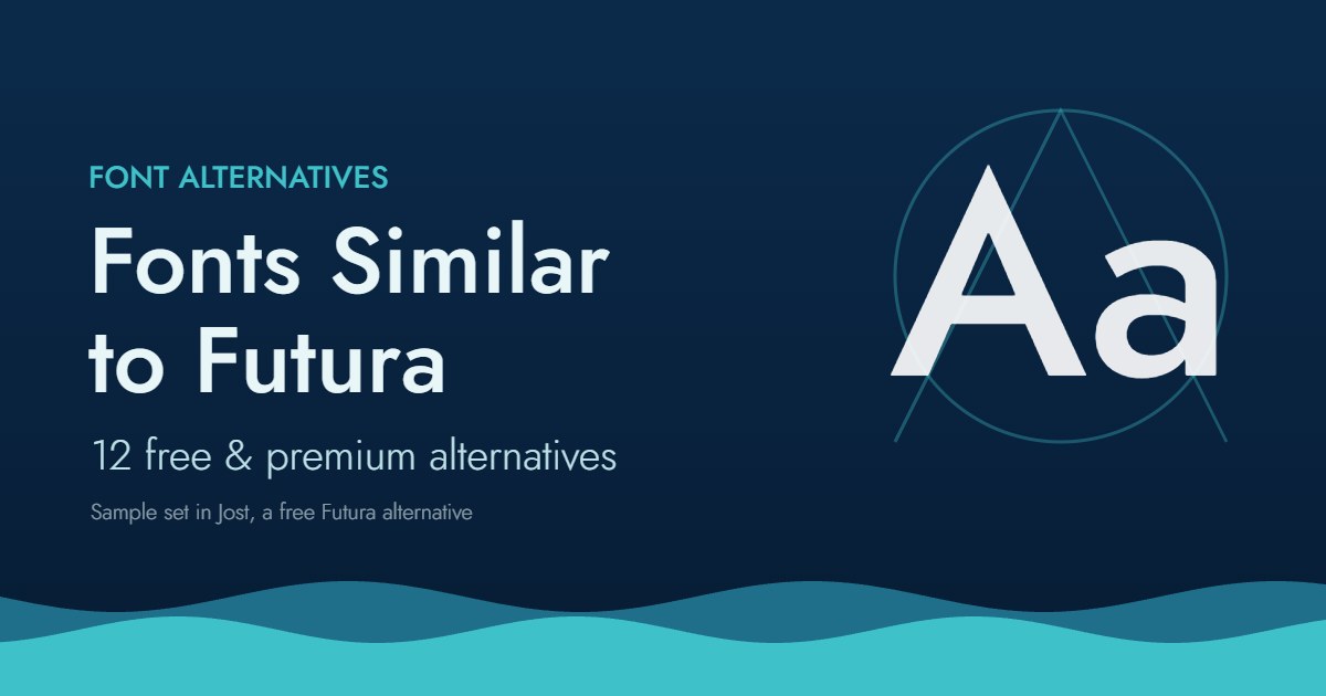
Futura is one of the most recognizable typefaces ever made. Paul Renner designed it in 1927 for the Bauer Type Foundry, and nearly a century later its circles, triangles and sharp apexes still show up on fashion brands, film posters and tech logos.
The problem: Futura is not free, it is not on Google Fonts, and the many digital versions differ more than you might expect. Some projects also just need the feel of Futura without the exact letterforms.
This guide covers the best fonts similar to Futura in two groups: free options you can use today, and premium alternatives worth paying for when quality and consistency matter. At the end you will find a comparison table and a quick way to choose.
We earn a commission if you buy through links on this page, at no extra cost to you. Disclosure
What Makes a Font “Similar to Futura”?
Before comparing options, it helps to know what you are actually matching. Futura is a geometric sans serif, and its look comes from a few specific traits:
- Near-perfect circular bowls in letters like o, c, d, p and q.
- Pointed apexes on A, M, N, V and W, which give the capitals their sharp, architectural feel.
- Short x-height and tall ascenders, so lowercase text looks elegant rather than compact.
- A single-storey “a” that is basically a circle with a stem.
- Low stroke contrast: lines are almost the same width everywhere.
A good Futura alternative keeps most of these traits. Fonts like Poppins or Montserrat are often called “Futura-like”, but their larger x-height and rounded apexes make them read quite differently, especially in uppercase.
Free Fonts Similar to Futura
These are free for commercial use under open licenses (mostly the SIL Open Font License). Always check the license file before shipping a logo or product.
1. Jost — the closest free Futura alternative
Jost, by Owen Earl (indestructible type*), was drawn as an open-source take on Futura. It keeps the pointed apexes, round bowls and small x-height, and it comes in 9 weights with italics, plus a variable version.
Best for: websites, branding on a budget, any project that needs “Futura, but free”.
Where: Jost on Google Fonts.
2. League Spartan / Spartan
League Spartan revives Spartan, the Futura lookalike that Linotype released in 1939. Its heavier weights are excellent for posters and headlines, and in all caps it is one of the most convincing free matches. The Google Fonts version has no italics.
Best for: bold headlines, logos, posters.
3. Josefin Sans
Josefin Sans is more vintage and more delicate than Futura, with a very low x-height and a strong 1920s flavor. It is not a drop-in replacement, but it captures the era better than most.
Best for: fashion, weddings, editorial headings.
4. Urbanist
Urbanist is a modern geometric sans with clean circles and a slightly larger x-height. It is easier to read on screens than Futura, at the cost of some character.
Best for: UI, apps, landing pages.
5. Poppins and Nunito Sans (honorable mentions)
Both are often recommended as Futura alternatives. They work well for interfaces and body text, but they are friendlier and wider than Futura. Use them when you want a geometric feel, not a Futura look.
Premium Alternatives to Futura (Worth Paying For)
Free fonts are great, but they have limits: fewer weights, weaker kerning, limited language support and no foundry support if something breaks. For brand identities, packaging and print, a licensed font is usually the safer choice.
6. Futura PT (ParaType) — the most popular digital Futura
If you want actual Futura, Futura PT is the version most designers know. ParaType’s family has dozens of styles, a significant 2022 expansion and a Version 3.000 update in 2024. On MyFonts, single styles start from about $39 and the complete family costs around $399 (check current pricing).
Best for: brand work that requires real Futura, print, packaging.
Get Futura PT on MyFonts →
7. Futura Now (Monotype) — the most complete Futura
Monotype’s Futura Now is a re-digitization of Renner’s original designs with 102 styles: Text and Headline optical sizes, Condensed widths, a Display subfamily and Futura Now Script. Variable font files are included. It is the most complete Futura on the market.
Best for: large brand systems, editorial design, anyone who needs optical sizes.
Get Futura Now on MyFonts →
8. Twentieth Century (Monotype)
Monotype introduced Twentieth Century in 1937 as its answer to Futura. It is slightly wider, with shorter ascenders, larger counters and more open apertures. Many people have seen it without realizing, because a version ships as Tw Cen MT with Microsoft Office.
Best for: a Futura look with slightly better readability.
Get Twentieth Century on MyFonts →
9. Neue Kabel (Linotype)
Kabel came out in Germany in the same period as Futura, but it is more playful, with angled terminals and quirky details. Neue Kabel is a modern expansion of the classic. Choose it when Futura feels too cold.
Best for: retro branding, posters, packaging with personality.
Get Neue Kabel on MyFonts →
10. ITC Avant Garde Gothic
Designed by Herb Lubalin and Tom Carnase, Avant Garde pushes geometry further than Futura, with very round letters, a large x-height and famous ligatures. It is a cousin rather than a twin: louder and more 1970s.
Best for: logos and display text that should stand out.
Get ITC Avant Garde Gothic on MyFonts →
11. Avenir Next
Adrian Frutiger’s Avenir modernized the geometric sans of the 1920s with more humanist proportions. Avenir Next is warmer and much more readable in body text than Futura, which makes it a smart choice for UI or long copy that should still feel geometric.
Best for: body text, interfaces, corporate brands.
Get Avenir Next Pro on MyFonts →
12. Brandon Grotesque
Hannes von Döhren’s Brandon Grotesque mixes geometric shapes with softer, 1920s–30s details and a low x-height. It has been popular in branding and packaging for over a decade.
Best for: lifestyle brands, food and drink packaging, hospitality.
Get Brandon Grotesque on MyFonts →
Comparison Table: Futura Alternatives at a Glance
| Font | Free / Paid | Closeness to Futura | Italics | Best for |
|---|---|---|---|---|
| Jost | Free | Very close | Yes | Web, budget branding |
| League Spartan | Free | Close (caps) | No | Headlines, logos |
| Josefin Sans | Free | Inspired | Yes | Fashion, editorial |
| Urbanist | Free | Loose | Yes | UI, apps |
| Futura PT | Paid | It is Futura | Yes | Brand, print |
| Futura Now | Paid | It is Futura | Yes | Large type systems |
| Twentieth Century | Paid | Very close | Yes | Readable Futura look |
| Neue Kabel | Paid | Same era, different mood | Yes | Retro, packaging |
| ITC Avant Garde Gothic | Paid | Cousin | Yes | Display, logos |
| Avenir Next | Paid | Softer cousin | Yes | Body text, UI |
| Brandon Grotesque | Paid | Inspired | Yes | Lifestyle branding |
How to Choose the Right Futura Alternative
Pick a free font (Jost) if: you are building a website, a personal project or an MVP, and you only need the Futura style.
Pick a licensed Futura (Futura PT or Futura Now) if: a brand guide requires Futura, you are printing packaging, or the client needs a font that will look identical everywhere for years.
Pick a cousin (Twentieth Century, Avenir Next, Kabel) if: you like Futura’s geometry but need better readability, more warmth or a different personality.
Two practical tips:
- Test in caps and in lowercase. Many fonts match Futura in uppercase but fall apart in running text.
- Check the web license separately. A desktop license usually does not cover embedding the font on a website.
Need a partner font? Futura pairs well with humanist or classic serifs such as Baskerville or Garamond.
FAQ
Is there a free version of Futura?
No. Futura itself is a commercial typeface. The closest free alternative is Jost, which is open source and available on Google Fonts, followed by League Spartan for bold headlines.
Is Futura available on Google Fonts?
No. Google Fonts does not offer Futura. Use Jost if you need a free Futura-style font for the web, or license Futura PT or Futura Now as a webfont.
What is the difference between Futura PT and Futura Now?
Futura PT is ParaType’s long-standing digitization and the version most designers have used. Futura Now is Monotype’s newer and larger re-digitization, with 102 styles, optical sizes, condensed widths and variable fonts.
Is Century Gothic similar to Futura?
Somewhat. Century Gothic is a geometric sans, but it is based on Twentieth Century and is wider with a larger x-height. Jost or Twentieth Century are closer matches.
What font is closest to Futura in Microsoft Word?
Tw Cen MT, Microsoft’s version of Twentieth Century, is usually the closest Futura-like font that ships with Office.
Conclusion
The best font similar to Futura depends on what you need. Jost is the closest free option, League Spartan wins for bold caps, and Futura PT or Futura Now are the right call when the brand needs the real thing. If you want the geometric look with more warmth or readability, try Twentieth Century or Avenir Next.
Browse the full Futura family and its alternatives on MyFonts, and test them with your own text before you buy. Get Futura PT on MyFonts →
Browse every font we have covered on the All Fonts page.